The Design Process and Texturing
First a small recap.
For the Asset Design unit I had to choose a main theme and a sub-theme, and then create an asset/environment that fit those themes.
For the main theme I chose Fantasy and then Decay for the sub-theme.
For my asset idea, I first looked at what environment I would be developing it for. My environment idea is going to be a cottage in the forest with an alchemy lab in the upper part of the building. This lead me to look into what things I would see in this environment, specifically the alchemy lab. I decided that I would make a potion bottle of sorts as I could incorporate fantasy into it through magical effects and then decay through the appearance of the bottle or other things.
With that part of the process done, I could start developing my asset.
The Design Process
The next thing I had to do was start making the asset. For this I used Maya (a 3-Dimentional modelling software) which made me nervous at first as I had never used it before and was largely different to Blender animation, which I already had experience using.
As I do with any new application, the first thing I tried to do is familiarize myself with the controls, the commands and the things I could do. Mainly using basic blocks and the different tools showed me how I could make my asset to the best of my ability.
To begin modelling my potion bottle I made some different styles of the base bottle formation. These ranged from a classic circular or spherical shape to the angular design you can see below. Since I had wanted an angular design that looks out of place, the blocks below were the starting point for the design.
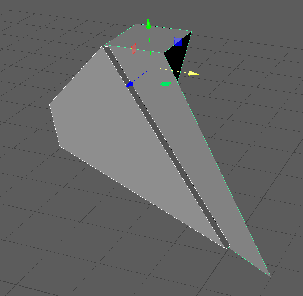
The next part of my model which is very important is the bottle neck and mouth. I started it by having a simple cube which I beveled and stretched to a rectangular shape. After that I face selected the top face and extruded it to add height and a raised place for the bottle mouth to be made from. Making the bottle opening at the top was slightly more complicated as I started to extrude and move vertices for that sharp shape that I had imagined. Moving the vertices around proved troublesome at first as they also changed the way the edges were placed. While this is fairly obvious to happen, I struggled to put them into the correct position. In the end, I inset a face into the upper part making the lowered part of the mouth. That allowed me to move some vertices around more with a basic shape being maintained.
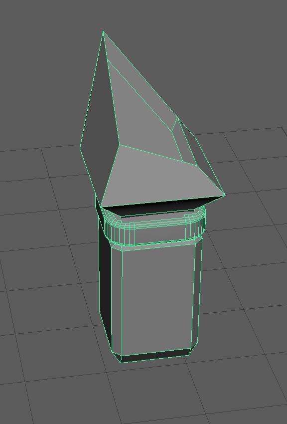
Moving down from the bottle neck, I added a cube where the rest of the bottle would be attached to. I also added decorative rings to the bottle neck on the outer section and the part where the neck meets the mouth.
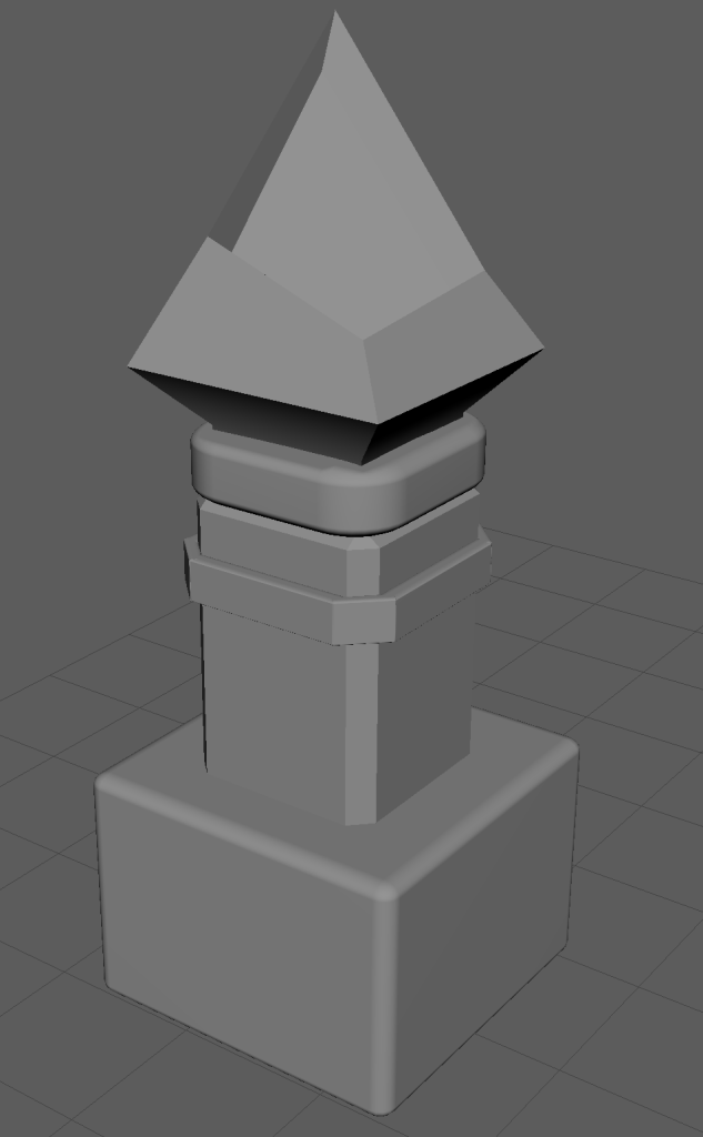
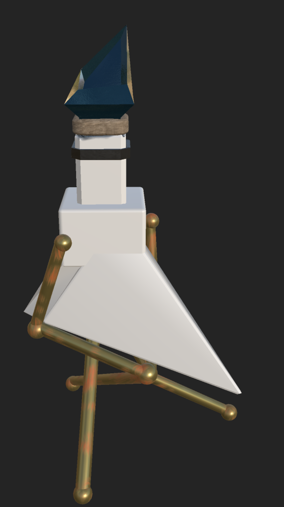
Adding the bottom part of the bottle was done by reshaping cubes to make an angular bottle that is close to what I envisioned.
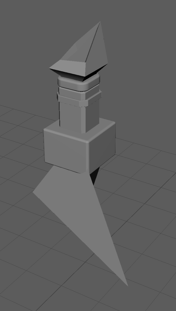
After putting the finishing the bottle’s base and attaching it to the neck, the asset was complete. Adding materials to different parts of the bottle would make it so that it would be easy to texture when moving to Adobe Substance Painter 3D.
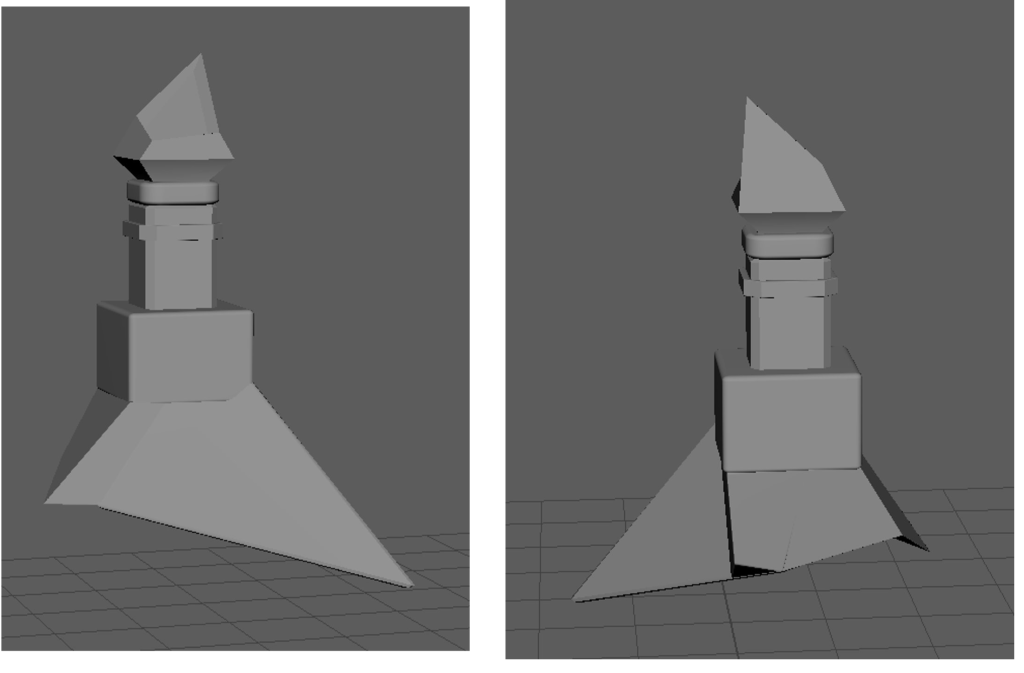
With the bottle design finished, the next part of the development process was UV unwrapping. Upon starting this part of the process, it came to my attention that Maya didn’t agree with extreme shapes which my asset was mostly made of. The solution to this was to add edge loops in order to make more faces, instead of leaving some very extreme shapes.
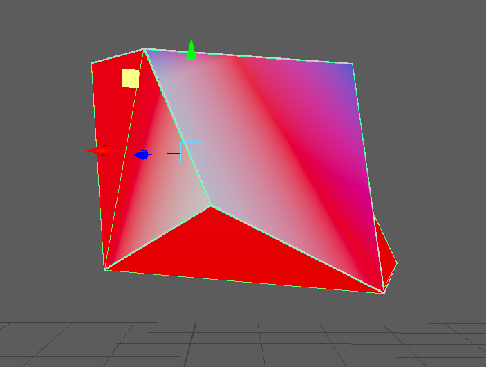
After adding the edge cuts to the necessary shapes, I was able to UV wrap it. This would make each face visible in Substance Painter and, in turn, make it easier to texture.
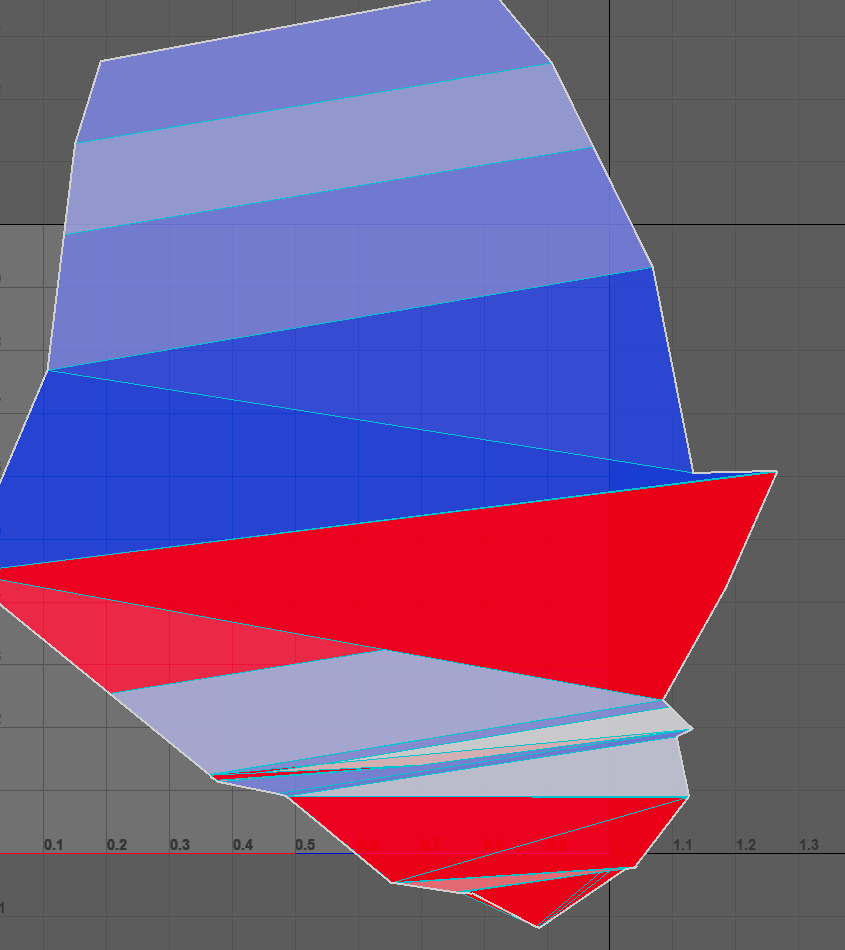
Continuing with UV unwrapping was easy after doing it once and became second nature after moving up the asset.
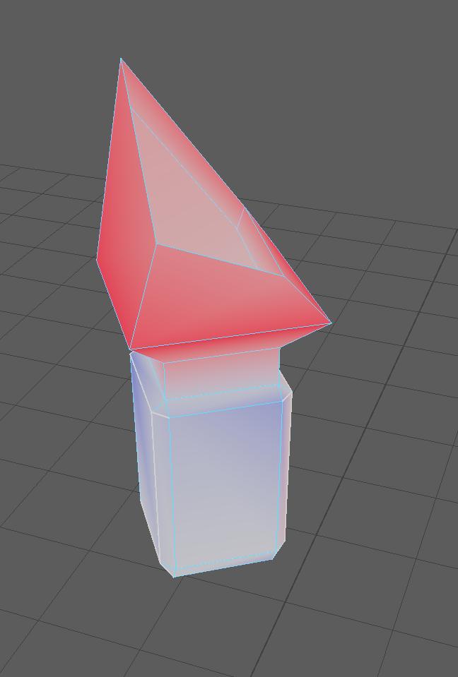
After finishing the UV process, the model was finished in Maya for now. I added some materials to different parts of the asset and then began exporting it into Adobe Substance Painter.
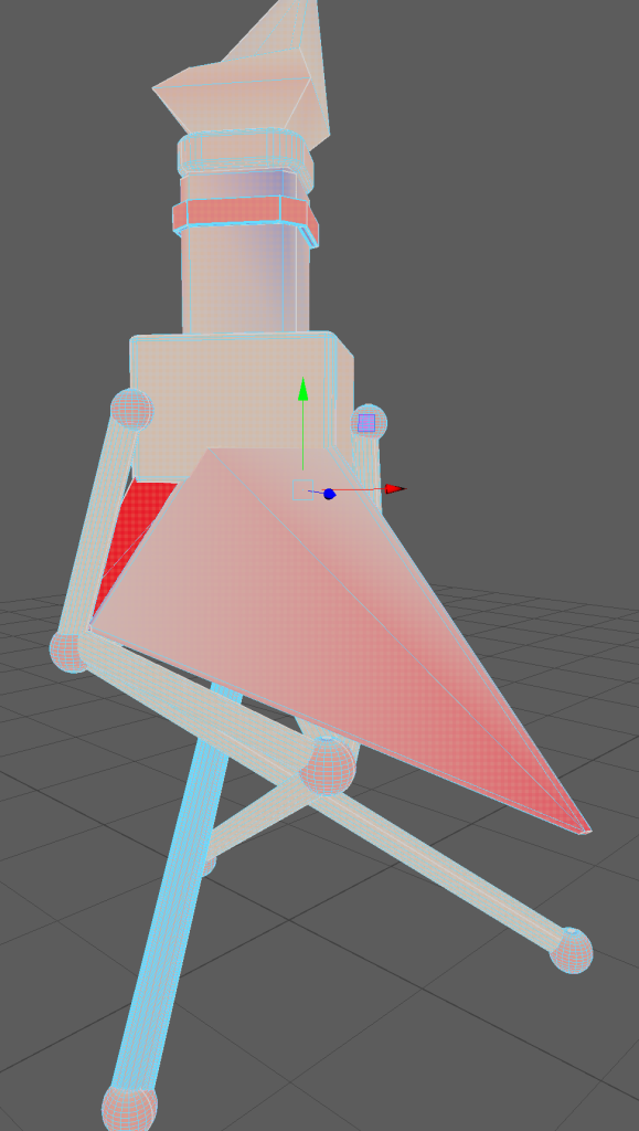
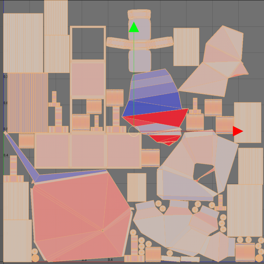
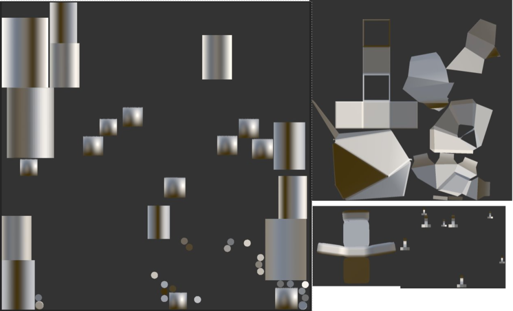
Below is an image of the UV view in Maya. It shows each object and face that have been through the process, ready for exporting.
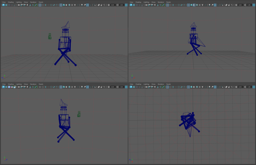
Wireframe views allow the user to see every edge on the asset. Below are the wireframe views of my asset from the sides, front and top.
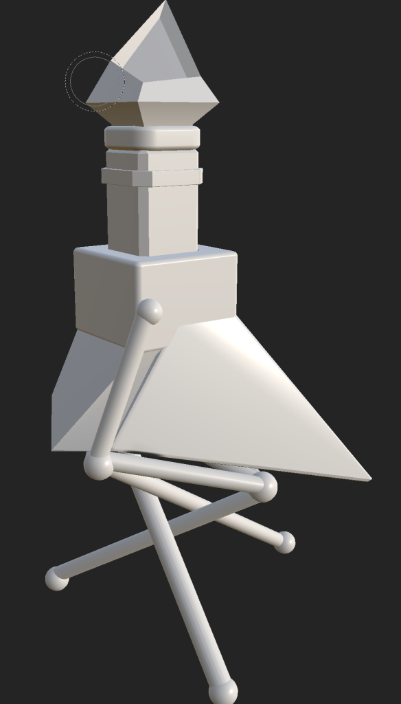
Exporting my asset into substance painter would allow me to texture and colour the model. Exporting the Maya file as a .FBX file allowed me to import it.
Inside Substance Painter, people usually use the views where you can see the asset and then the faces of the specific material that is selected. It allows you to draw on the textures that are applied only to the specific parts of the asset. For example, the larger image below is showing the faces of the potion bottles stand. When painting on the texture applied, it will only put the paint onto those faces. It makes it much easier to apply paint and texture to certain parts of the model.
When starting with substance painter, I first tried some rough ideas of what I wanted things to look like. The bottle stand was done with a gold material and then had rust painted on afterwards. The bottles cork was made with a wooden texture and the jewel above made with a PVC plastic.
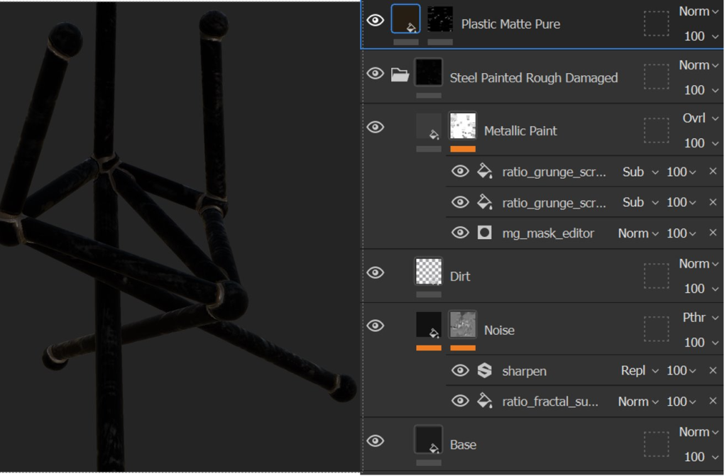
It was after this that I got some feedback on the model and some tips on how I should texture it. For the base I used a rough, damaged steel texture and then made a plastic matte texture for welding spots between the cylinders and the spheres. The welding was made by changing the paints colour to brown and making it paint at the edge of the brush with the center of the brush placing a silver colour. Applying this to areas where the different shapes connect make it look like the stand is not expertly made and is very makeshift. This is the sort of appearance I envisioned during the design process.
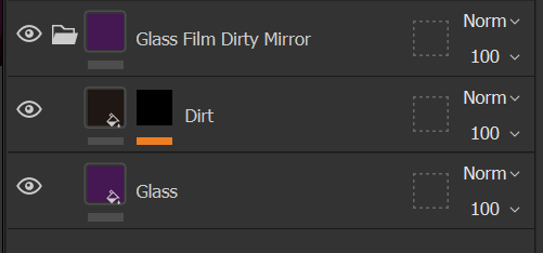
Now with a bottle, it usually needs to look like glass. To do this I followed a similar process to how I made the stand have its main material. Dragging the glass material onto the texture for the main bottle gave it the look of glass. Looking at the properties tab, I was able to change the colour of the glass to a dark purple. I then made it less reflective and more opaque.
And to finish texturing the main part of the bottle I did glitter on the jewel located on the top of the bottle. This gave a shiny stylized look that I was hoping to deliver.
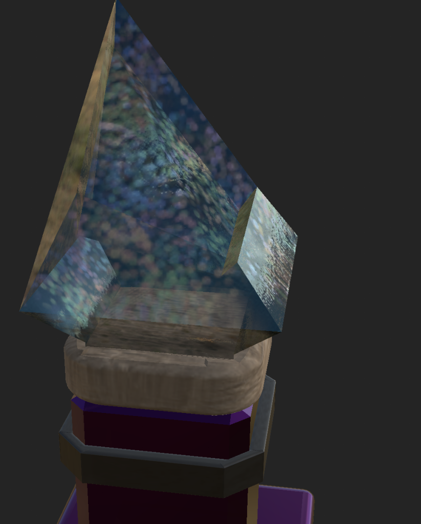
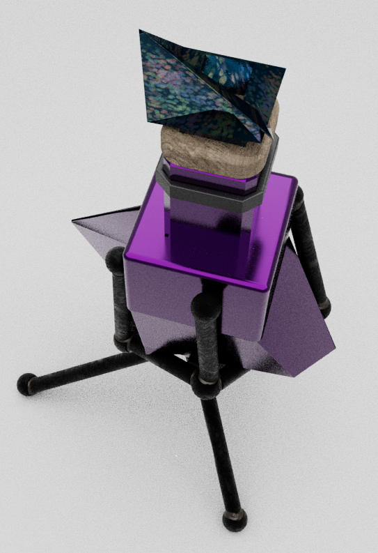
All of the texturing leads to the image of the final product below. The changes to my original idea have worked well and I am overall pleased with the outcome.
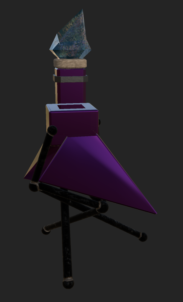
Bringing the textured asset back into Maya, I was able to fully render it using Arnold, the built in rendering function. Below are some beauty shots I took in Arnold render view, to show off the asset from different angles.
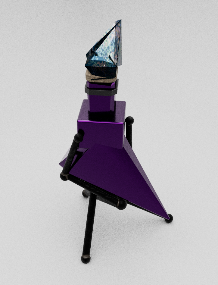
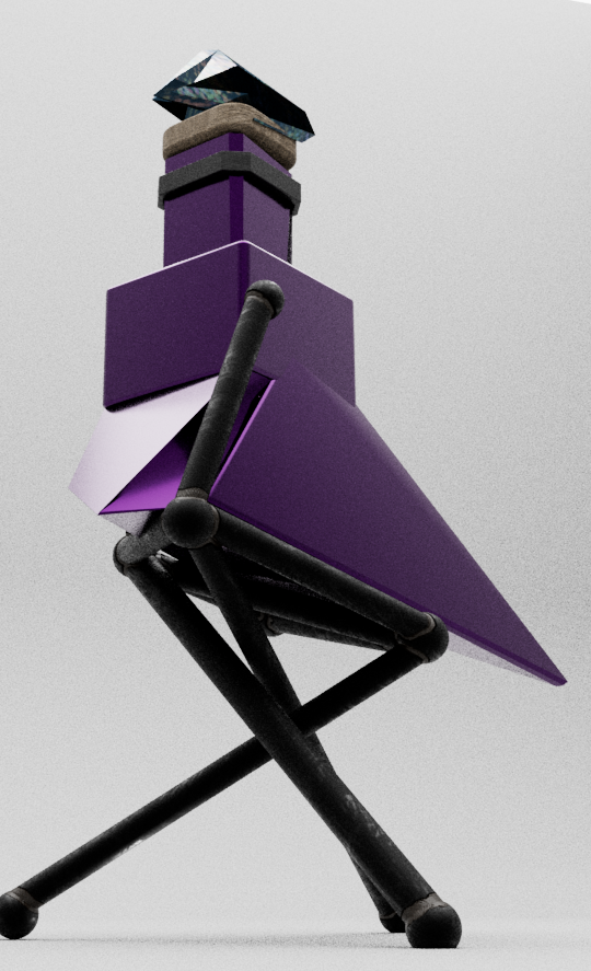
I also recorded my asset with a view that travels around the entire object.