Research
For the Environment Design unit I had to choose a main theme and a sub-theme, and then create an environment that fit those themes.
The four main themes were Horror, Fantasy, Science Fiction and Historical with the eight sub-themes being Alien, Corruption, Utopia, Dystopia, Celebration, Decay, Family and Beauty.
For the main theme I chose Fantasy and then Decay for the sub-theme.
I chose fantasy for the very large amount of reference imagery or videography I could take inspiration from. Playing many video games and watching lots of television/cinema meant I had a wide scope of the fantasy genre which I could use to generate ideas.
With decay as a sub-theme, I first had to gain an understanding of what decay is and how it differs to corruption. Both sub-themes are present in the show “The Last of Us”. The corruption appears on screen in the form of the infected and the cordyceps vines/tendrils that cover the landscape. However, decay works in the durability of the environment in the show. Many buildings are broken down or destroyed, being decayed.

Generating ideas for the environment was fairly easy once I decided on the theme/sub-theme. I looked into the media I knew and that led me to the decaying structures of The Last of Us. The very broken down buildings of a modern world fascinated me, leading me further into decay as a topic. However, the environment needed to fit into the genre of fantasy and the architecture of places like Boston and Salt Lake City don’t exactly scream swords, axes and magic.
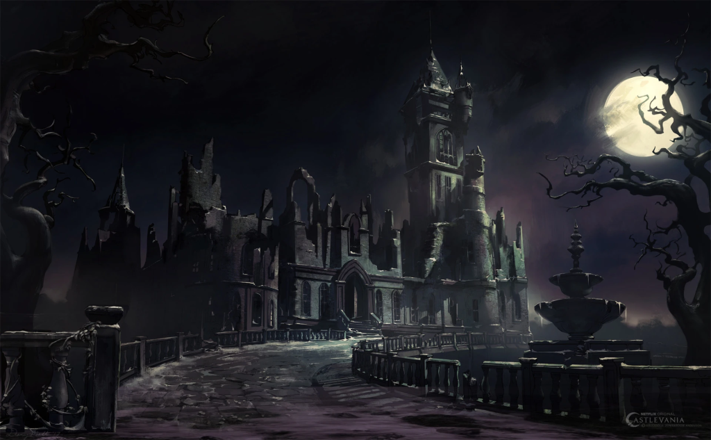
This lead me to look at some fantasy shows and video games to see what is more suiting to the aesthetic I would want to portray. Games like Dark Souls, Elden Ring, Skyrim and more were considered but I settled on using the environments of Castlevania, a Netflix adaptation of the original Dracula story, to . With gothic art styles and dark fantasy environments based from the story of Dracula it made perfect sense to gain inspiration from.

Idea Generation
My environment idea is going to be the corner of a crumbling cottage with a alchemy lab, overlooking a small forest clearing. The decay will be implemented in the room and the outer look of the building with the fantasy being through the design of the building and the surrounding area.
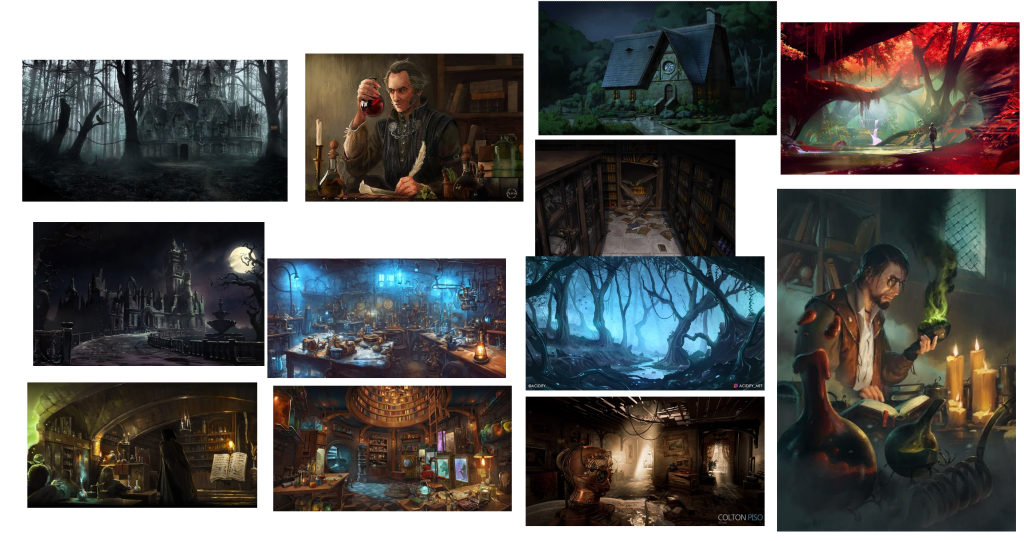
The following mood board contains images that I used to inspire my environment and to be used as reference images for when I am actually producing some parts of my environment. There are images of potion brewing desks and labs of many sorts for the laboratory segment of the environment and the majority of the other images are that of decaying buildings, forests and a cottage.
The Design Process
From the outset, I had to be learning constantly to produce an environment as it should be developed in Unreal Engine 5 (UE5), an application I had little prior experience in. My focus at first was learning many of the basic operations, controls and similar things. Along the process I did add materials to objects. In most cases this is only as a place holder or something to keep me remembering what material I would want it to have.
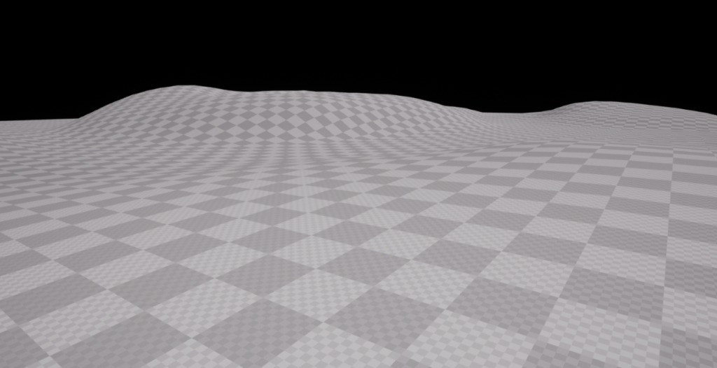
When I actually started making my environment, the first thing I knew needed to be done was the landscape. Using the landscape tool this was fairly easy to produce the first block. The difficulty came in the form of sculpting the environment by raising/lowering/flattening/smoothing the ground. I eventually managed to figure out the tool and produced a landscape with raised hills and bumps that would fit my final piece (see image below).
After landscaping the basic shape of the ground, the next thing to do was to model the actual building that would house our lab. Alternate building designs were considered but were too complicated to make and would require a lot of skills that I did not possess.
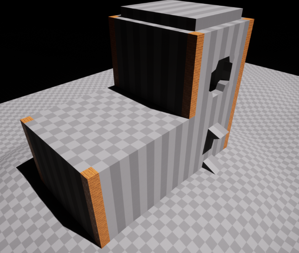
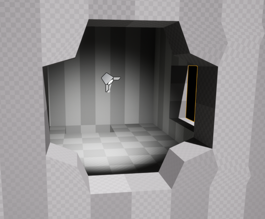
So with a basic building shell made I could hollow out the upper area of the house for the alchemy lab. I decided on having 2 windows, one rectangular seen slightly on the right, and the other at the front of the image which is more unorthodox in design. I left a point light in the room so that it was visible in the image and so that I could view what changes I needed to make later into the project.
Every house needs a doorway. Otherwise how would you get in. Taking inspiration from one of the buildings on my mood board, I made a rough sculpture of a doorways surroundings with lights on either side which would eventually be made into braziers. Also included is an awning implying there is weather that the houses owner would want to escape the rain while unlocking the door or was often used to give protection from icicles. For reference, an awning is the overhang often on the front door of a house which is used to keep the sun or rain from the door.

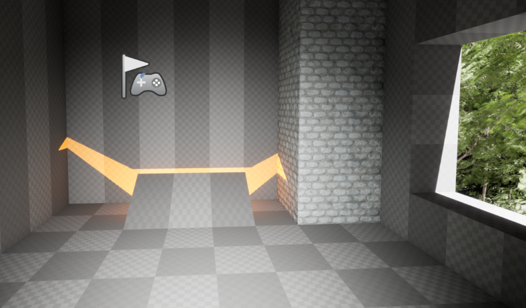
To get into the lab, there needed to be an entrance. I could have made a small landing area with a staircase and door leading from the lab to the rest of the house but I believed a trapdoor fit the aesthetic more. Using the modelling tool I hollowed out a small space to put a light and then made the door as seen in the image below. When completed my hope is that the light flickers like fire and reflects into the lab from the door being slightly ajar.

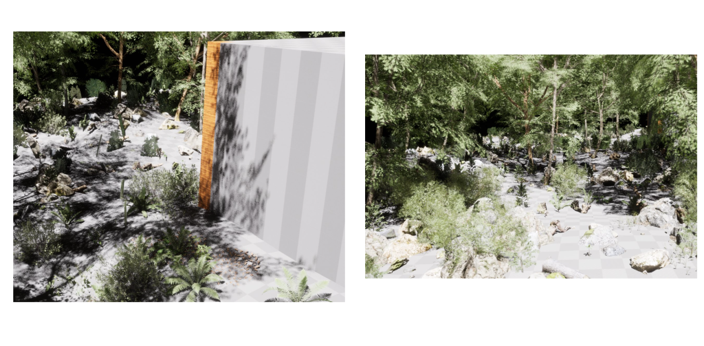
At this point I started to explore some of the other tools that Unreal engine had to offer, specifically the foliage tool. Using a model pack I found on the Unreal asset store, I made the forest area I was hoping to produce with things such as trees, rocks, logs, ferns and more. The left image shown below presents some of the foliage near the building and the other image shows more of the greenery that is further away from the structure. I later removed some of this to make producing the building structure easier.
Adding onto the original structure would make the house look more like an actual cottage so I modelled a chimney breast and applied one of UE5’s built-in materials as a placeholder so that I could put a more fitting one in later. In a second look at the lab you can see the new structure beside the entrance to the laboratory. The light placed under the door can be seen in the room allowing some light to enter.
Something that I had to experiment with a lot was the roof of the cottage. Many designs would look good on the building and would fit very well into my wanted aesthetic however, modelling the roof seemed to be very difficult. I tried to use the modelling tool to produce blocks that I could transform into the rough shape of the roof but I found that hard to do. After some time on other parts of the project I used the stairs prefab to make some shape as the empty space discouraged me from developing other parts of the environment. While the stairs are a very rough idea for the actual roof, I really dislike how it has turned out currently.

Moving into the laboratory furnishings was next for me to tackle and it went rather smoothly.
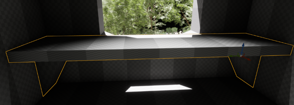
Making a table to stand in front of the main window was very easy. Using the modelling tool, I made the initial tabletop with 2 cube extrusions. After that the poly editing tool was used to make the cubes slimmer so that it looks like an actual table. Two other cubes were added at either side of the room to support the table. These were made with the same tools.
Every table needs a seat so you can use it as intended. A stool is aesthetically fitting to the environment and stools are more prominent in labs regardless. For the design of my stool I analyzed the asset I am making alongside this and took some of the design. The legs of the stool are made in the same way as part of my asset. Made from 6 spheres and 3 cylinders, the legs of my stool will properly support the user. Taking the design idea from my asset and applying it to other parts of the environment made sense as the inhabitant of the lab would likely have many of their things in a specific style of uniformity.

As I had developed the table and was applying materials to objects as reference points for later, I decided to try making the table look weathers, old and untouched. I did this by using the modelling tool for a very thin cube thing and then applying the built-in dust material in Unreal Engine. While it does look old and as if nobody has been there recently, it is not the extent I had imagined.

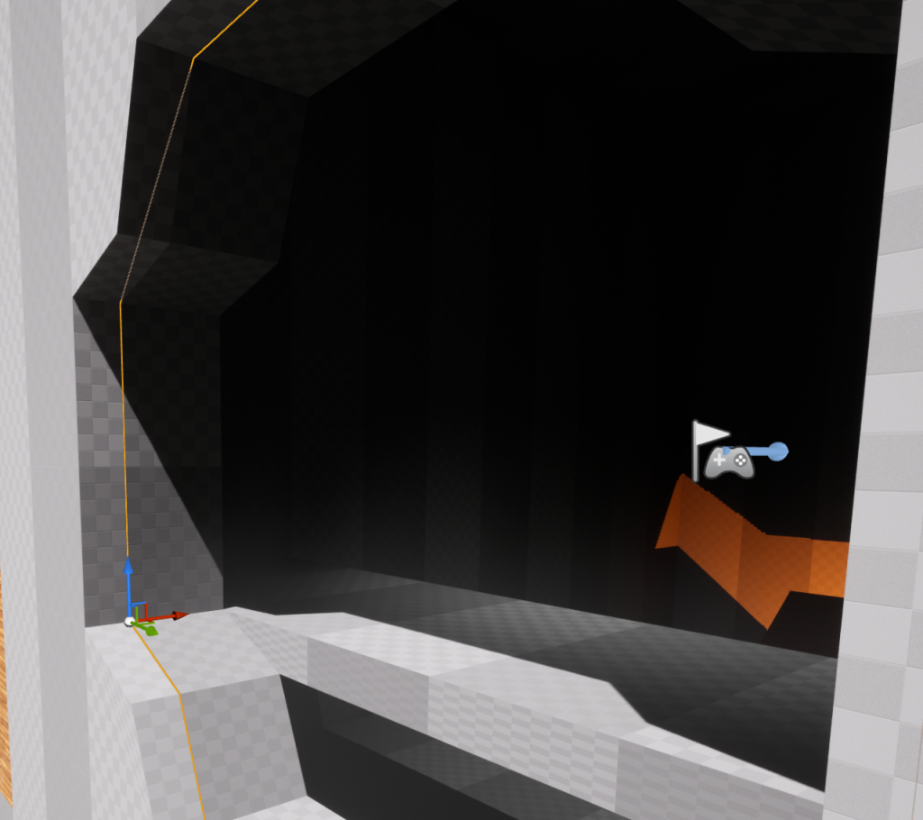
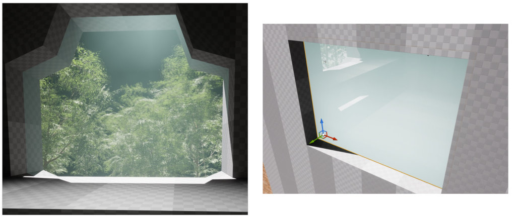
Moving back to the windows from earlier in the development process, I had discovered how to add materials to objects correctly. What I started with doing was making the front windows shape with a separate set of blocks. Making them into the shape of the window was done with minimal effort by moving the vertices of the shape to fit the window and then making it slimmer so that the glass wouldn’t be the whole wall in thickness. Applying a glass material which comes as standard in a project was the last thing I expected to do for a finished product but, as seen in the image below, the glass window is not visible.
Continuing with the material issue, I inspected the actual materials properties. Looking into the different parts that make up the glass material let me find how to change it’s colour appearance and opacity. I changed the colour to a light blue and then made it visible. After saving the changes and applying it to my project, the outcome met my expectations.
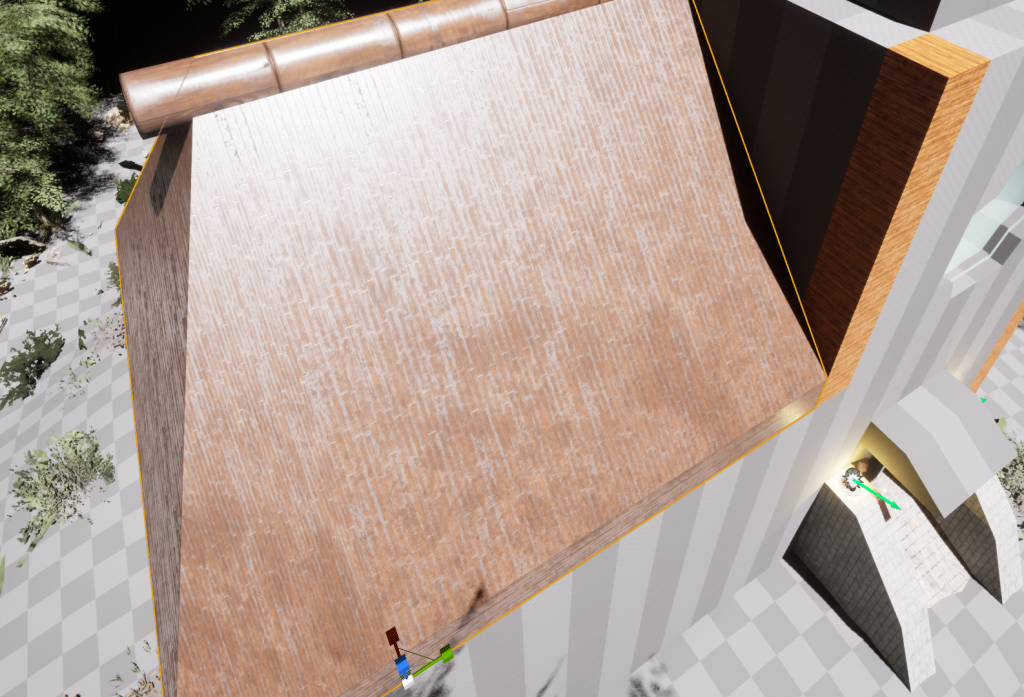
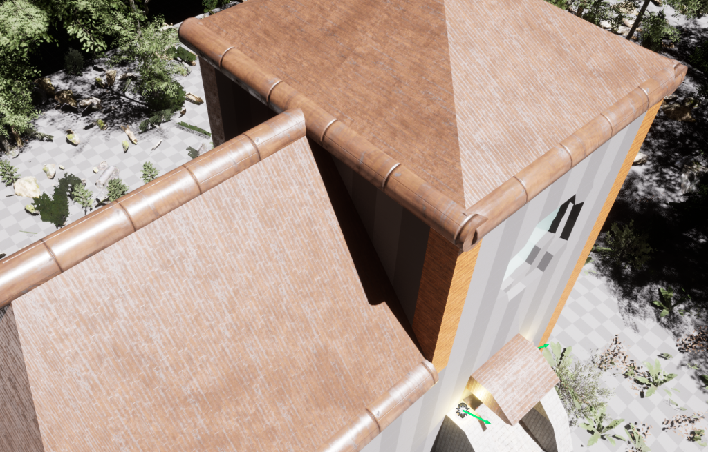
After figuring out the glass for the windows I thought I should redesign the roof to make it look better and more fitting for the environment. Deleting the old stairs model gave me the space back and then I moved to the modelling tool. Creating a layer of blocks on the base of the roof let me split the area into 4. Two areas split the ceiling down the middle with the other two being at the corner areas of the roof. Using the corner mode tool of the modelling area let me pull the vertices of the cubes to create height. Doing that allowed me to get the slanted roof design that is used on many cottages.

Repeating the process on all segments of the lower roof allowed me to make it fully formed, giving me a basis on what I am looking to have as the final product. Applying one of the in-built materials to the object let me enhance my mental image onto the environment and adding a cylinder made sense to have as a log for support.
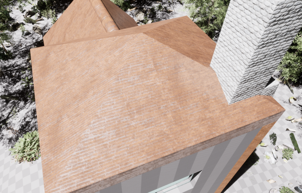
Making the upper roof above the lab was easy now. I followed the same technique with the corner mode of the modelling tool. Splitting the roof into 4 equal sections made the roof east to extrude and finish. The chimney is something I added earlier in the project development process and was easy to have as it doesn’t clash with any parts of the building I had already made. The chimney follows a vertical path down, through the laboratory and moved out of the back of the structure.
Adding on to the first log on the lower roof, I added “support beams” at the edges of the roofing. This emulates the support that the roof would need in order to stay in position. The roof is subject to change at a later stage of the development process.
At many points in the process up to this point I was unhappy with the way the foliage looked. Deciding to re-do the foliage also let me texture the landscape with the tools and materials I had found on an UE extension called Quixel Bridge. Using the landscape painter tool, I was able to draw the materials onto the environment floor.
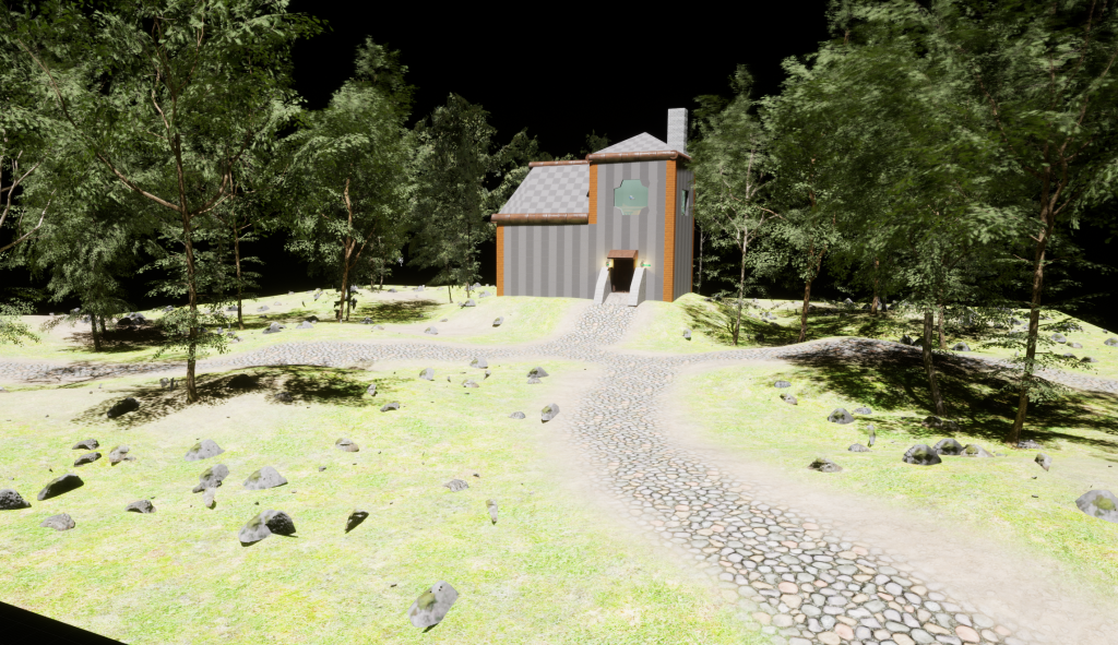
After adding the textures to the environment and some larger parts of foliage, it was time to add some smaller plants and such in order to make the forest look unkept and unbothered as I had first imagined.

Upon the completion of the foliage, I was given some feedback. In this feedback I realized that the environment needed to be much larger than I had first anticipated. Using the landscape tool again, I was able to add more segments to the area as squares getting the full area to a decent size.
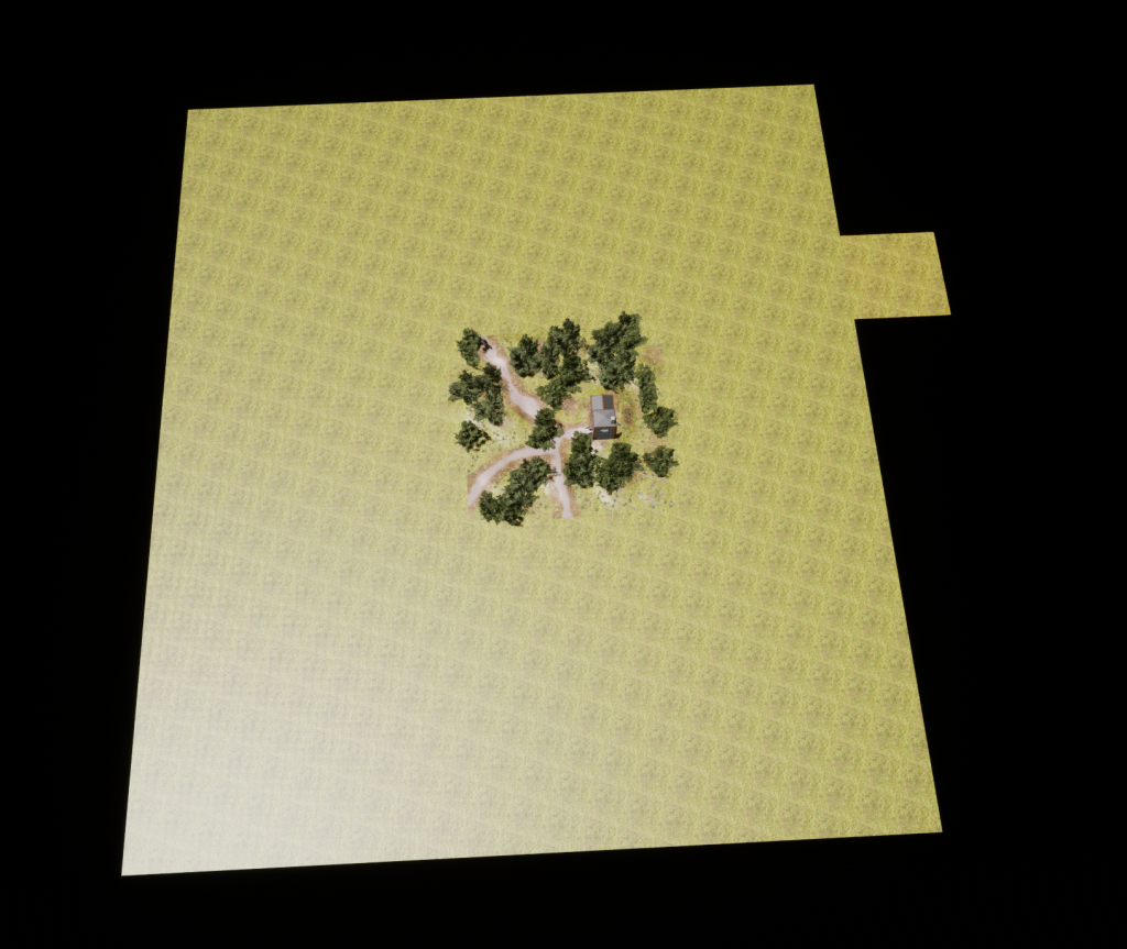
After extending the base floor of the environment I added the same textures to the landscape using the same method as earlier. I extended the original 3 roads I had laid down and then drew random patterns of my dirt texture.
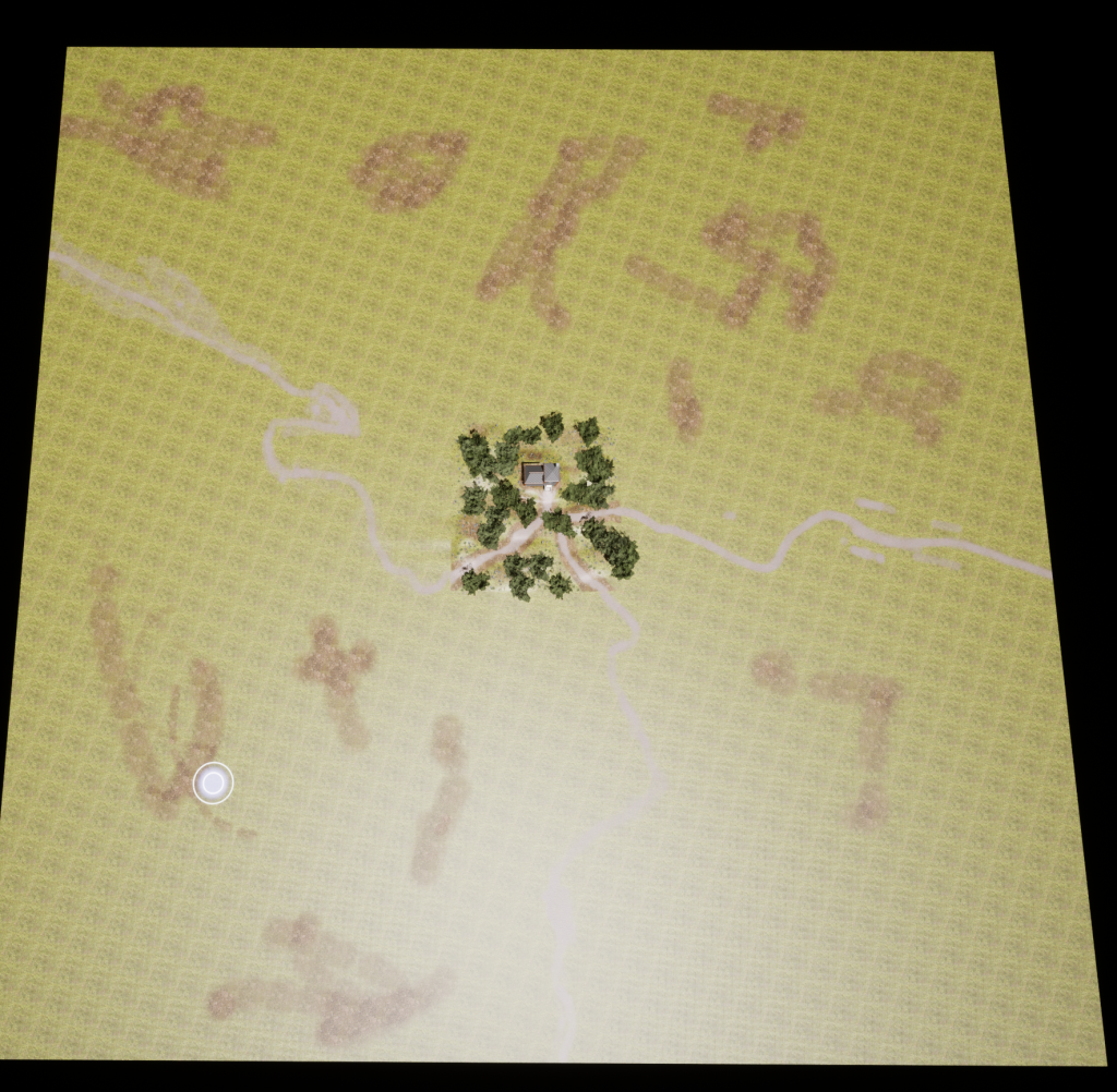
Adding more foliage to the environment was the next thing to do as it would be very empty otherwise. Starting with the trees, the extended area looked much better immediately as it emulated the forest environment I envisioned in the design process.
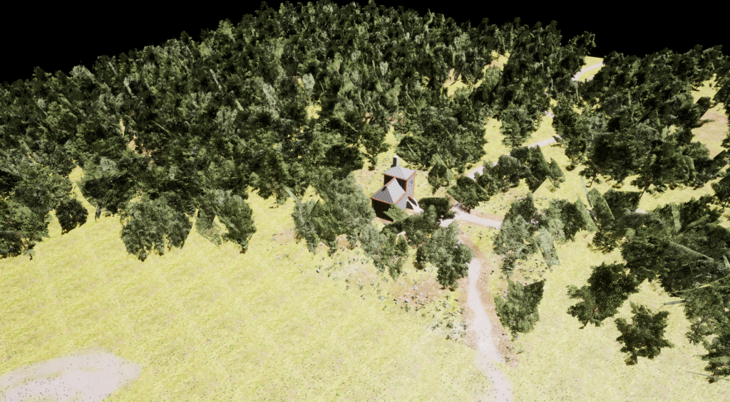
After finding assets in quixel bridge, I began to remake the house from the ground up. Starting with a stone base, the general shape of the building was made and would be used as a support for the rest of the structure.
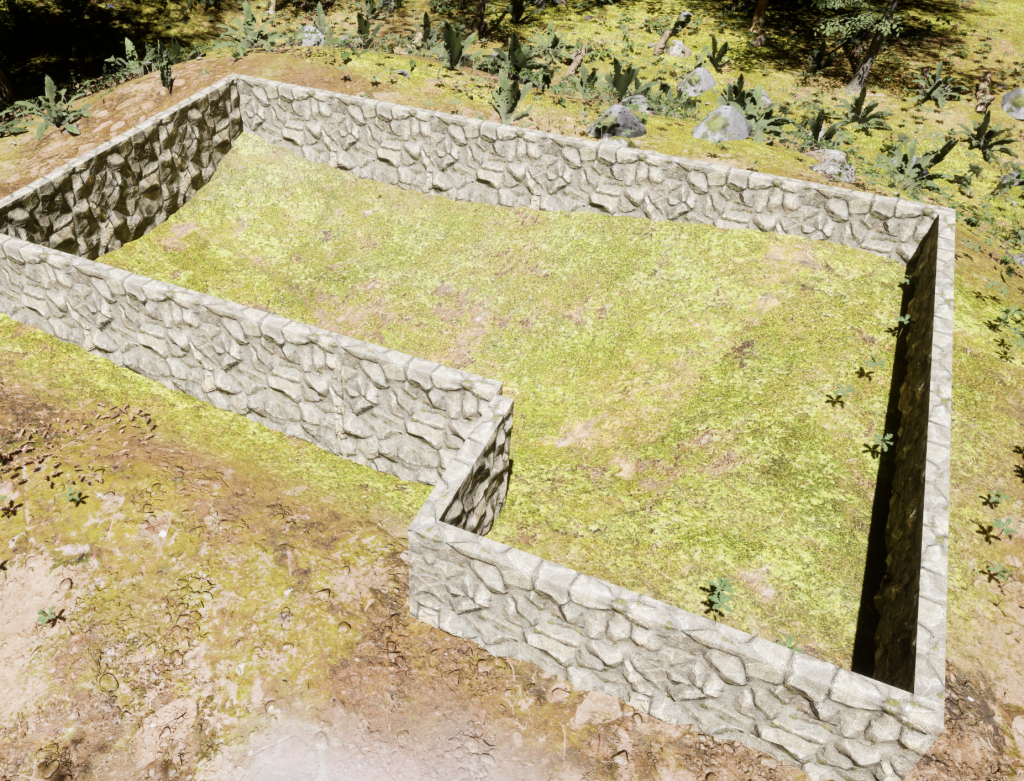
Adding a wooden floor to the stone walls made the actual flooring of the houses ground floor.

Putting another layer of stone walls up, I modelled the bottom half of the ground floors walls and put a doorway at the front.
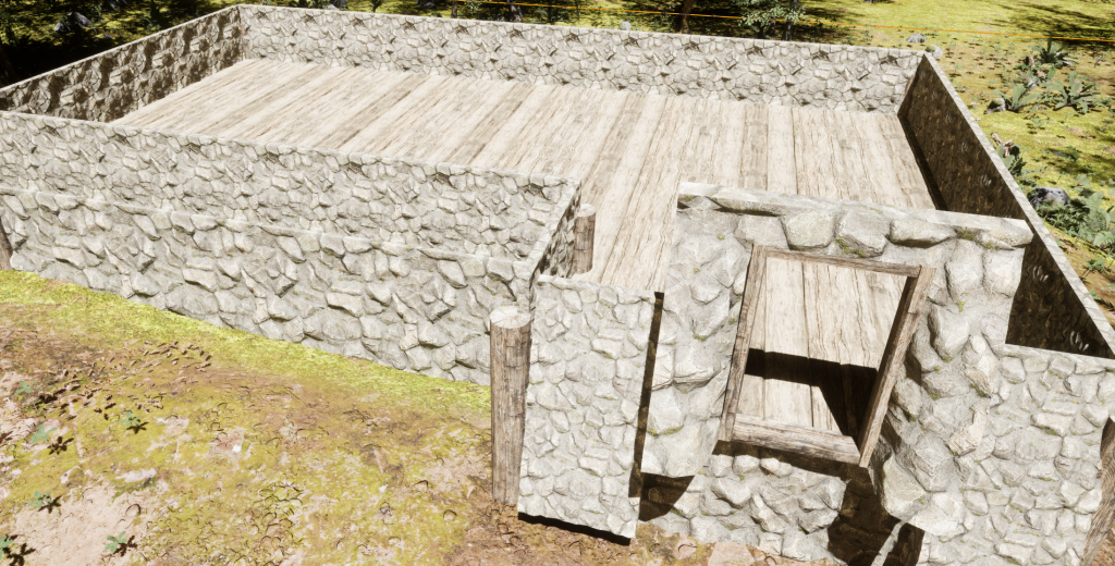
Wooden walls made up the rest of the ground floor. I also added some wooden logs as support beams to give the building simulated structural integrity. Adding a ceiling to the ground floor lay some base for the laboratory and made the building appear more finished at the time.
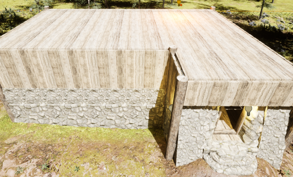
An indoor view of the building without furniture is shown in the image below. It can be seen that there are many cracks where assets do not fit together exactly. This is addressed later into the development process.

Next up was making the laboratory. This is the place where my created asset would go and it had to be made well. Following the same processes from the ground floor, I made the wooden walls up and added the support beams on the corners.

I also added the front window and some windows on the side of the building. This would be to give the room some natural lighting and make it slightly more open instead of looking like a box.

The next part of the houses development process was the roof. This is a part I have struggled with throughout the process as it would never look how I had imagined. Using assets from the same building pack, I made the roof from corner pieces that looked like thatch roofing. In fantasy settings, roofs were often made of thatch as it was an easy to acquire resource and was able to be combined with other materials to offer a solid, semi-rain resistant substance.
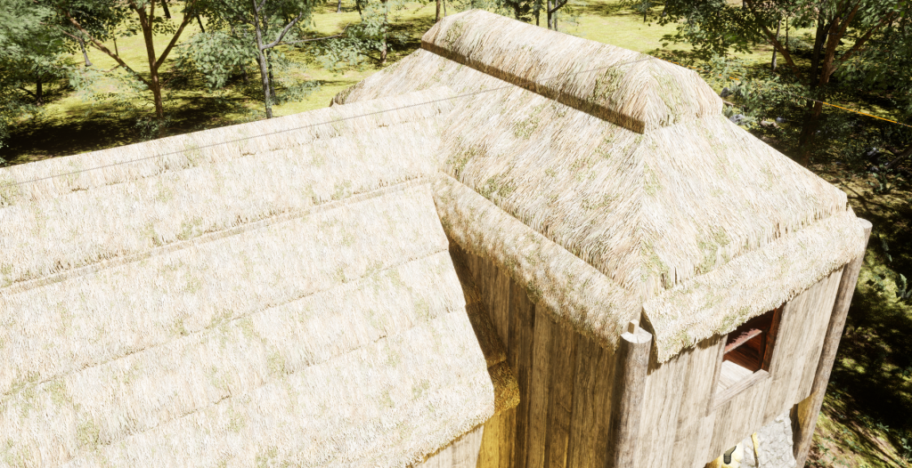
Adding windows to the lower part of the roof gave the ground floor some access to natural light. With corner and edges pieces being added to gaps in the roof, the light on the inside of the building was fixed and allowed for a well made structure.
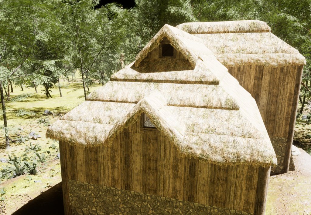
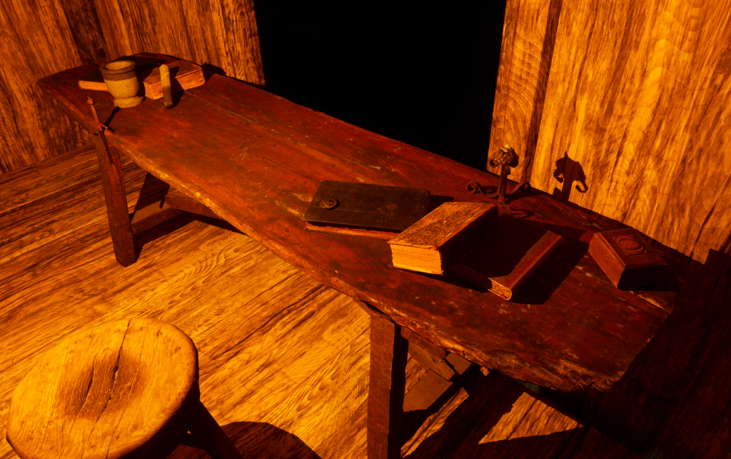
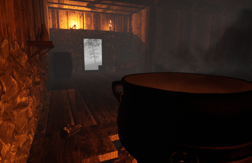
After finishing the roof, I returned to quixel bridge for some furniture. For the lab I used 3 different books, a table, a stool, candles and more. All of the things there would be used by a traditional alchemist.
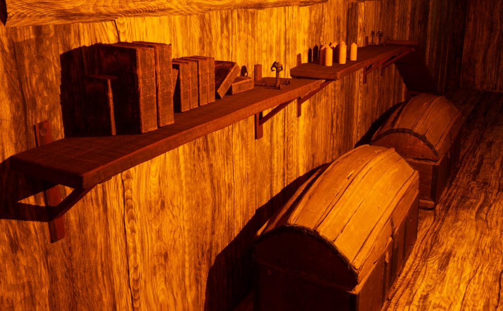
Also in the lab, I put 2 chests for storage and then shelves with items on.
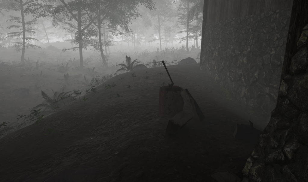
Outside the building I added some chopped wood, an axe and a chopping stump.
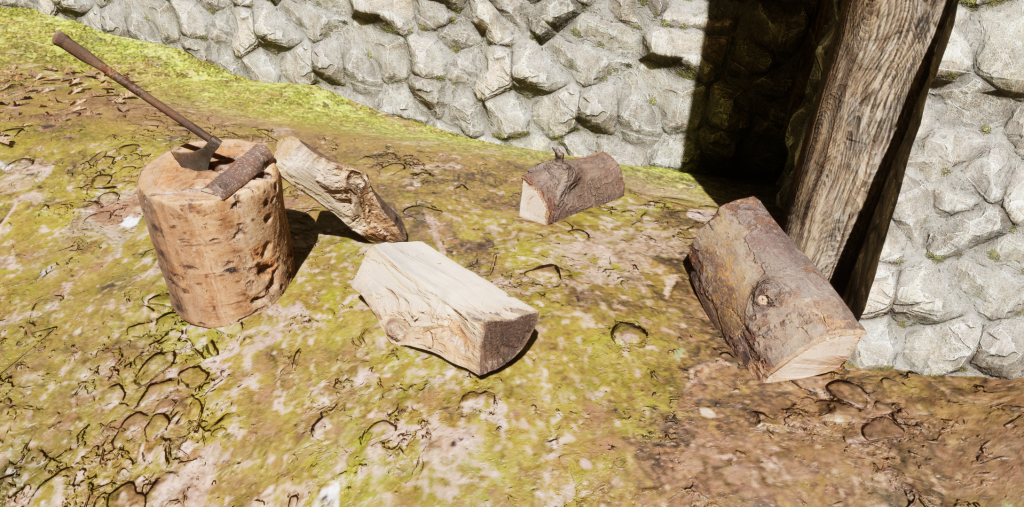
Inside, I made some changes to the floor to allow a cooking pot to be placed.

There were also barrels, buckets and storage boxes added by the door.
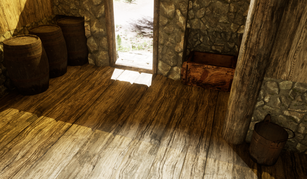
After finishing the furniture and the building, I needed to set the scene with weather. Using some tutorials from YouTube, I found out how to make a fog effect. This was placed over my environment.

Also added was a starry night sky. Having the scene set at night made sense as many media forms have this sort of environment shrouded in fog at night.

I then added flickering light effects onto specific point lights located around the house. This gave the effect that the candles were actually flickering alongside their fire effect.
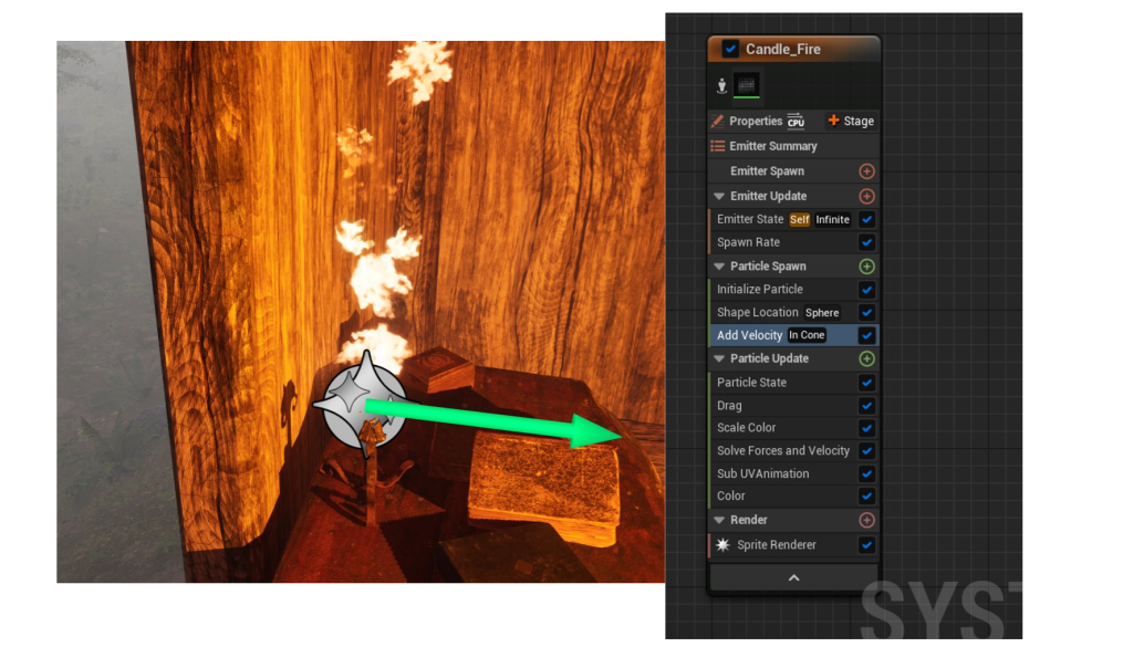
Below is how I made the lights flicker. Making a specific material and adding the correct nodes allowed me to make the light flicker. After that I assigned one of the 3 lighting materials to each point light.

I also added my asset that I made in the asset design module to the center of the table in the laboratory.

When I imported it, there were no materials applied to the asset. So I made my own in unreal by taking the base colour, normal, roughness and metallic maps to re-make the materials.

And that finishes the production of my environment.
Final Product
Below is a video of my environment, showing off some of the house and the area around it.
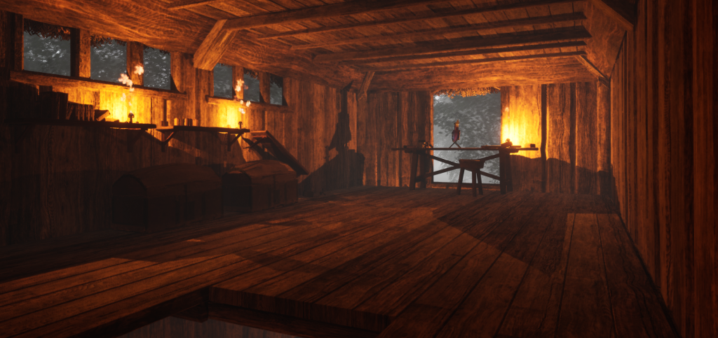
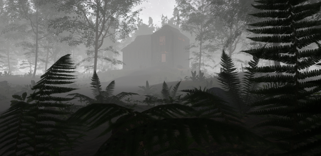
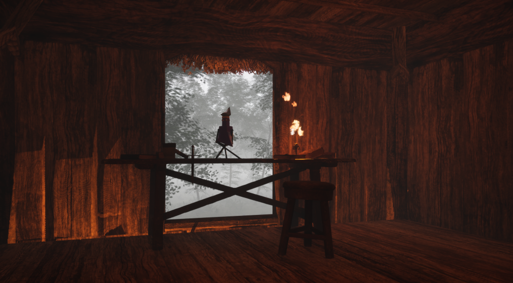
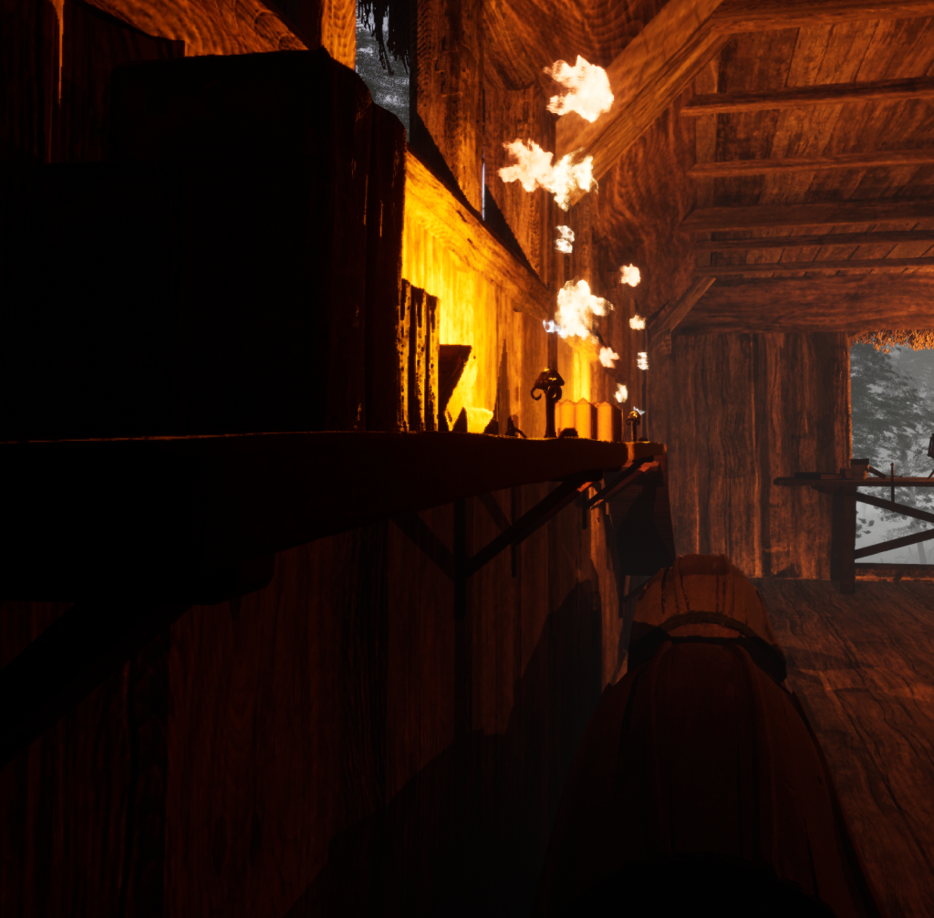
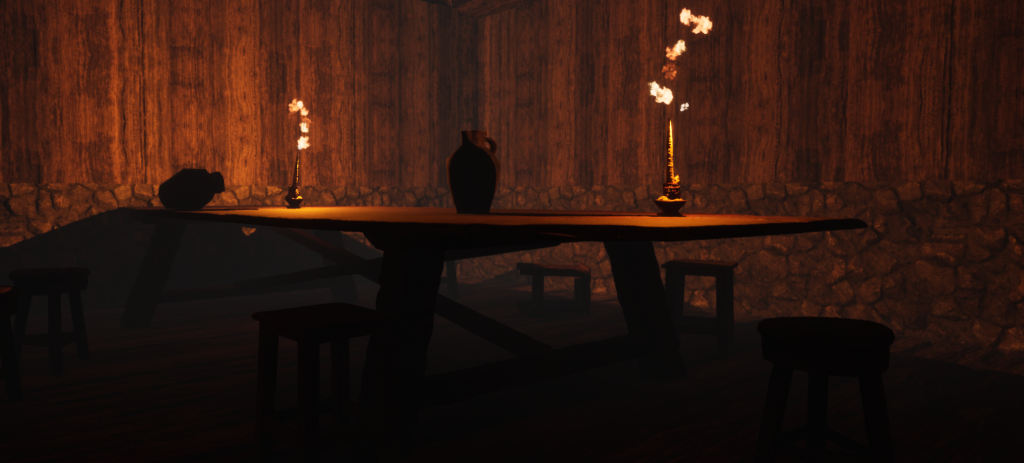
I also took some beauty shots of the environment to give some more detailed views.

Alternate Idea 1
Many designers and developers will often come up with other designs and/or ideas that were not produced to completion. An idea that I had generated fit into the Science Fiction theme with a celebration sub-theme. The environment would have been a Formula 1 circuit with a driver reaching his arm above the halo in celebration of a race victory while crossing the finish line. The main reason that I had not produced this idea was due to the fact that I found it in the middle of production of the environment that I did produce. It would have been a rather complicated environment to produce as I would need to make the circuit, the pit wall, the crowds and the track effect. However, with the correct knowledge of UE5, and my knowledge of the sport, I feel I would have produced a high quality environment that closely simulates the atmosphere of an actual race.

The track would most closely resemble the Jeddah Corniche Circuit in Saudi Arabia. This street race is currently on the official Formula 1 calendar and is the fastest street circuit on the calendar. A very good starting straight with grand stands to the right would make the perfect place for the environment with the pit area to the left.
Reasoning
The biggest reason why this asset is not the one I produced is because of when I came up with the concept. Midway through the production of my chosen asset, the potion bottle, I suddenly thought that it would be an interesting asset to make as it would mostly be guesswork with the design and I had a very large interest in the sport already.
Alternate Idea 2
One of my other ideas which I considered instead of this would be a futuristic environment of an empty city center (like times square) but without people or any signs of life. The environment would fit into the science-fiction main theme with dystopia as the most likely sub-theme as it would have futuristic objects like street lights, neon signs, discarded objects (umbrellas, open cars, litter, etc.) and would also set a certain aura of being creepy or ghostly.